Building the Foundation
Proofpoint's products looked like they came from different companies. I started FUSE to fix that — enabling cross-product consistency and an ability to change our Look and Feel later. Five years on, that decision is what let the entire portfolio be restyled in under a month.
Make it look like one company
Proofpoint's products had been built by separate teams over many years, and it showed. Different layouts, different patterns, different color schemes. Customers who used more than one product paid a mental price each time they switched. So soon after I joined Proofpoint in 2017, I formed a small team of volunteer designers and developers to build our design system, FUSE.
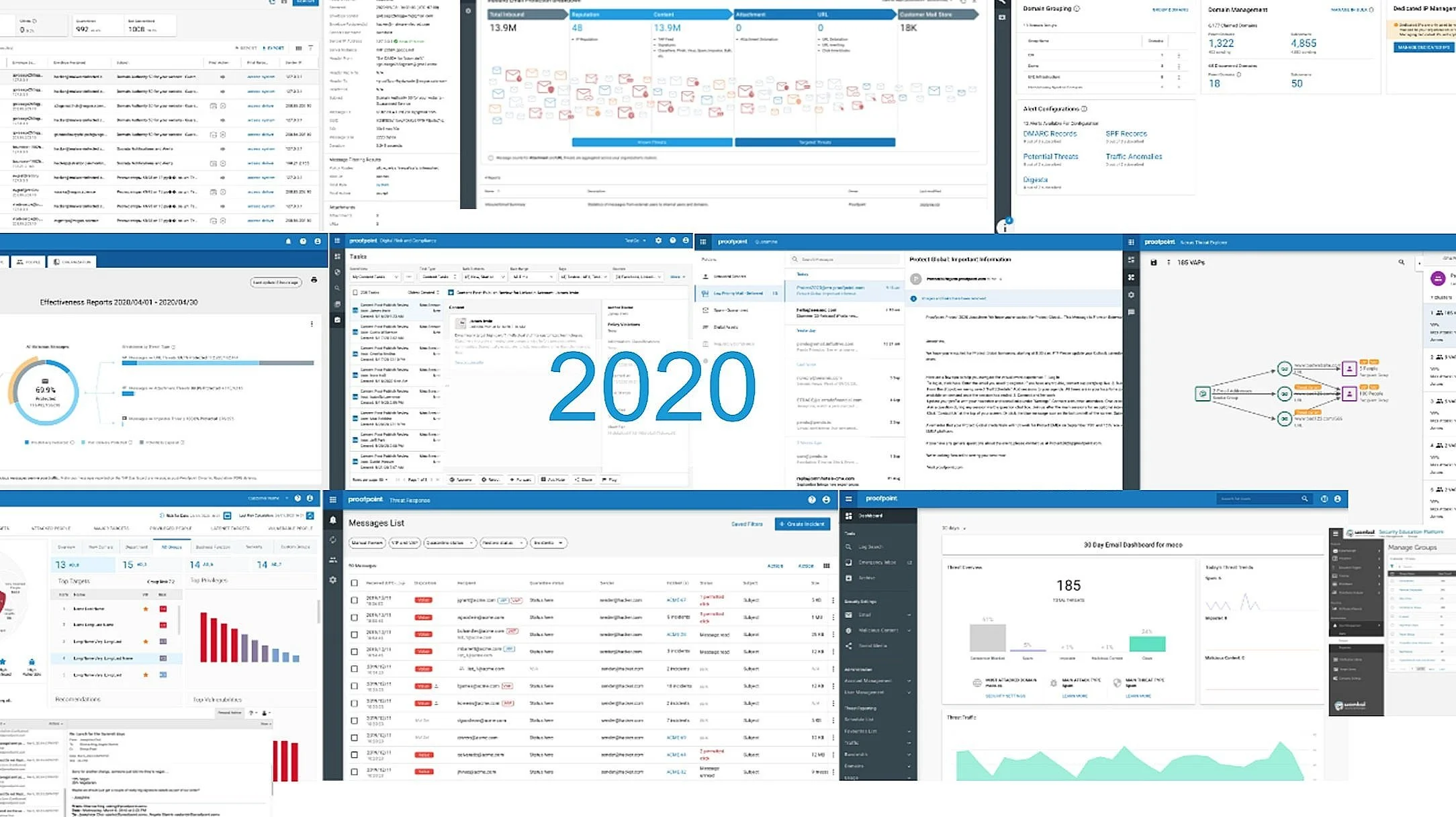
The first version of FUSE went after what they could see: a shared visual language, common patterns, and a single sign-on so moving between products stopped feeling like logging into different vendors. Starting around 2020 the portfolio shared a look and an identity.

Getting there took close to five years to reach roughly 80% product coverage. Adoption was difficult as each product team was built on a different set of UI components, so this initiative was often lowest on the priority list.
The level of adoption varied too. Some products took only the colors and layout, applying the styles on top of their existing components. Others adopted the entire component library. Full adoption was the ideal, because it let us make broad changes by pushing them out centrally.
Inner-sourcing success
FUSE was never a funded project. I ran the initiative through relationships I built with key designers and developers across the company. Progress came in fits and starts as we balanced the product work assigned to us against carving out time for Look and Feel consistency.
Gradual, visible progress on our product Look and Feel earned the team credibility, and with it our first dedicated resource in 2020, then an additional engineering resource later.
Today FUSE is built by a small set of dedicated resources and stands as a prime success story of inner-sourcing at Proofpoint.
A portfolio restyled in 6 months
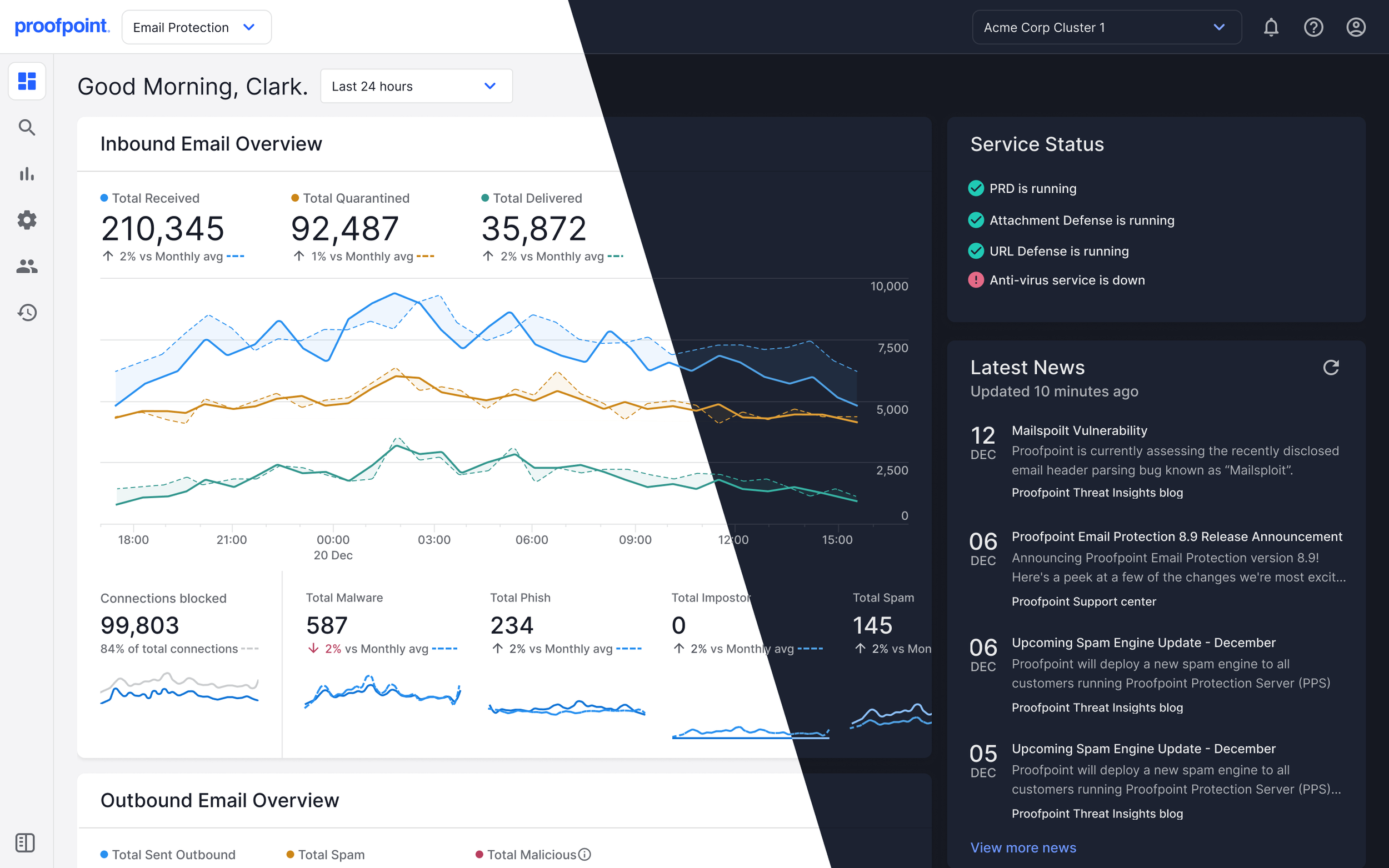
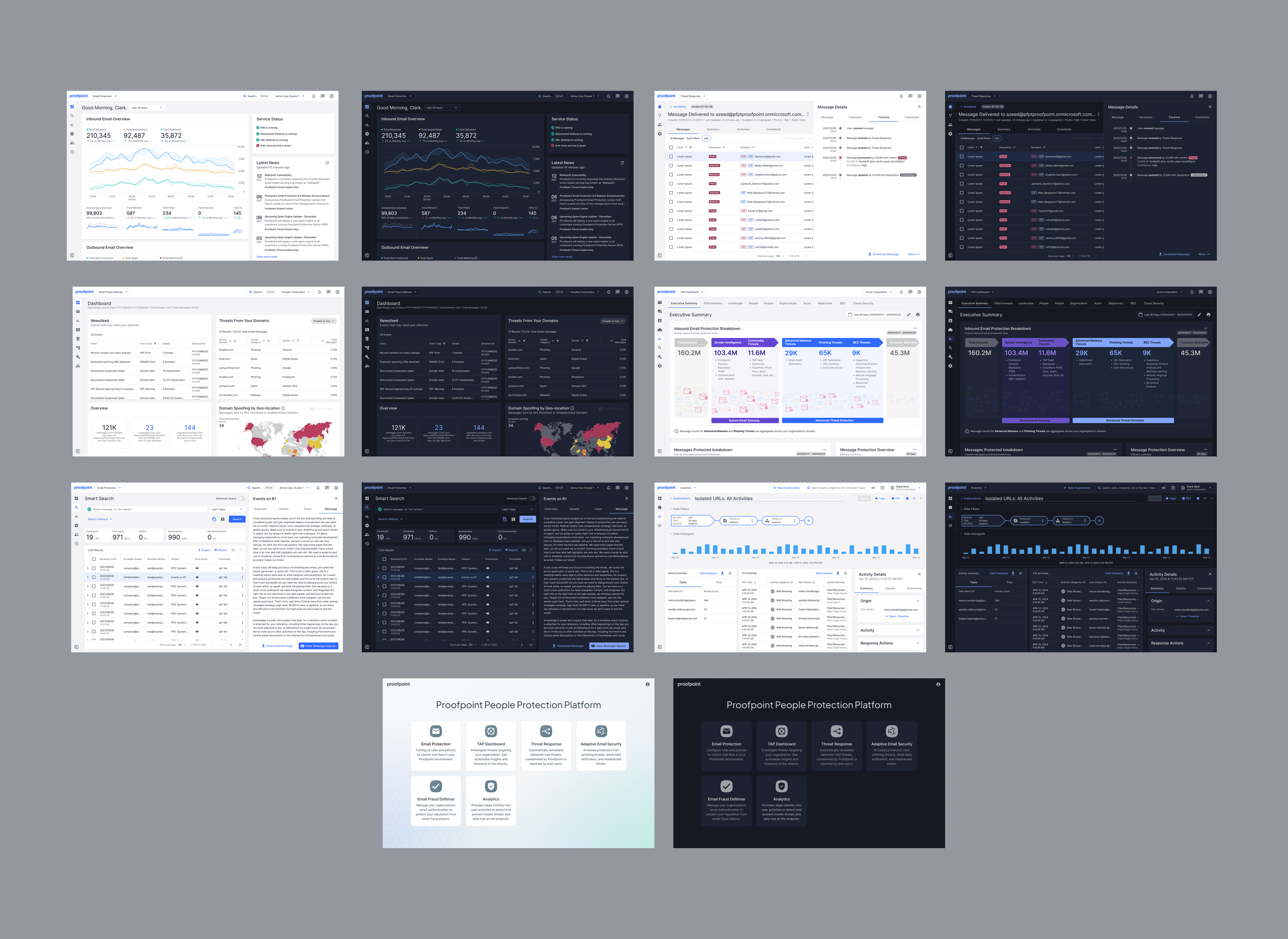
In 2024 Proofpoint introduced a new look with light and dark themes. Years of FUSE work made the path straightforward. Products that had fully adopted the component library only had to update to the new version. Products that had taken the styles alone had real work to do, but by then we had a network of engineers and stakeholders across the company who could support those teams and get them there quickly.
The engineering effort ran about six months across all the teams. The rollout itself was two coordinated weekends — five products turned on each weekend, 10+ in total.
New themes, and a path to consolidation
Once theming worked, adding to it cost very little. A high contrast theme shipped this year as a side project by a single designer.
The larger payoff is consolidation. A shared component library and a single UI stack are what make merging separately-built products possible without rebuilding each front end — the navigation layer included, since the App Bar, Side Nav, and App Switcher were part of FUSE from the start.